I love the pictures you created with your AI tool! They look so cool. Sounds like we use ChatGPT for the same things. It is an excellent studying tool. Thank you for bringing up biases in AI. This is a topic that is very interesting to me as a computer science student. There are several studies and reports of code actually being racist, which seems unintuitive, but the feelings of the developer can come out in code. This is something that should be addressed as technology becomes more ingrained in our world. You also made a great point about deepfakes. These can be extremely detrimental to society as it confuses people and can aggravate hate. I really like The Pudding website. It is so interesting, initiative, and creative. I will definitely be exploring it more. Additionally, thank you for bringing up the use of dynamic charts. These are so useful to data visualizations and really draw in users.
Blog comment on Addi’s post (can be found on the bottom)
Charlie McCullough
Hi Charlie! I really liked reading the story that ChatGPT wrote. Lots of funny puns. I also liked reading the Perplexity response. This may be a new tool for me to study with! I also agree that ChatGPT responses so quickly! Some days it is a bit slower, but generally it is extremely fast at responding. I have heard a few difference responses to the whole “AI is going to take over artistic jobs”. The one that stuck out to me was people arguing that artists may use other artists to help create their work. An example of this is Disney using many different artists to make one artists’ vision come to life. AI could do the same thing for artists today (and even Disney now). But AI will take away jobs from people, which is extremely alarming.
Blog comment on Charlie’s post (can be found at the bottom)
Nat
Hi Nat! Yes, in my experience ChatGPT does not help very much with spelling and grammar. There are other online tools that help with paraphrasing and such, but none that use AI. But, I am sure that AI will catch up pretty soon! I would also be careful about the resource lists. When it comes to academic papers, I have found that ChatGPT will make up papers that do not exist. It will just put together different titles to match what you asked for. I also agree with everything you are saying about ethical concerns. Plagiarism, fake news, and inaccurate information are all easily done/created with AI. There needs to be controls in place to ensure it is used wisely.
Hi Nicole! I loved reading your module 4 post. Thanks for pointing out what H5P stands for, I didn’t know it stood for HTML5 Package. Thank you for your introduction into apples and how they impact learning. I found that very interesting. The new food guide is very different. I remember in grade school when the food guide had a huge focus on dairy, there was always a glass of milk with the meal. Also, your lesson plan is so detailed and informative. I like all your uses of multimedia. After doing the readings I am happy to announce I got 6/6 on the H5P drag and drop! I really liked your reflection on all the activities and readings you had in the lesson plan – it was very informative.
Blog reply on Nicole’s post (found at the bottom of the page)
Addi
I think I missed the memo about doing Module 4 on food! You and Nicole both did healthy eating for children! Your lesson plan is so detailed and well done. Thanks for sharing that. I also did the H5P activities and I thought for some reason pumpkins were vegetables, but I guess not! I really liked reading your responses to the reflection questions, you are very insightful. Your list of ways to incorporate Merrill’s Principles of Instruction was really informative and something I may use in the future as a programmer! I also found the same thing about constructive alignment and backwards design: a lot of professors are missing this in courses. I also liked your insight into using AR or VR in games like Historia, its something I hadn’t thought about before.
Blog reply on Addi’s post (found at the bottom of the page)
Nat
Hello Nat, I really liked reading your lesson plan. I remember learning about the water cycle in elementary school. The teacher had us create little bracelets with beads to represent each step of the cycle. In your read/watch section, I really liked how you specified each video and reading time. This makes it easy to plan the lesson ahead of time. Your infographic is so cute too! I used the H5P applications and found them very useful, even as a university student. It allowed me to review my knowledge. I also had a few difficulties creating the H5P activities. It was a good idea to look for videos online.
For this module I explored the use of AI and data visualization. Both are very interesting to me as I am a computer science student and very fascinated by data visualization.
Generative AI Exploration
ChatGPT
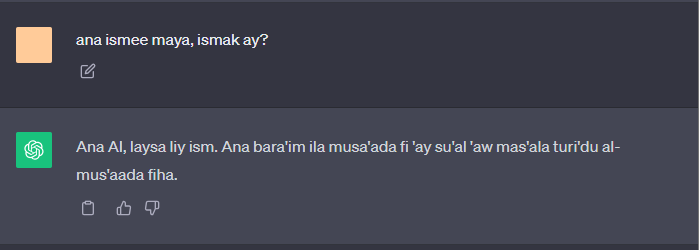
When I first tested ChatGPT, I asked a simple question in Egyptian colloquial Arabic, using the English alphabet transliteration. It should be noted that Egyptian colloquial Arabic is a solely spoken language and is very specific to the country. Therefore, I was very interested to know if ChatGPT could follow a specific dialect. I really did not think that ChatGPT would be able to understand my question in transliterated colloquial Egyptian Arabic – but surprisingly, it did.
(OpenAI, 2023a)
Translation:
Me: My name is Maya, what is your name?
ChatGPT: I am AI, I do not have a name. I am happy to answer any questions you may have.
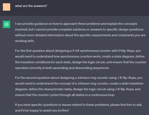
Next, I asked ChatGPT to make some sample questions for the digital design (CSC355) course I am currently taking. The professor had not given us many practice questions, so I wanted to see if ChatGPT could create some to help me study.
(OpenAI, 2023b)
The generated questions were very vague. I was unable to solve the questions from the limited information it provided. Additionally, the answers were incorrect. It really did not give me any answers, only instructions on how to solve it. I found this very intriguing.
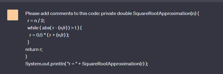
Lastly, I asked Chat GPT to add comments to some sample code I found online. As a computer science student, commenting and documenting code is very time consuming and difficult. If AI could do this, it would make my coding assignments a lot simpler.
(OpenAI, 2023c)
It did a very good job. Some of the comments were redundant and overly complicated, but overall it was very useful and I will probably use it again for this purpose in the future.
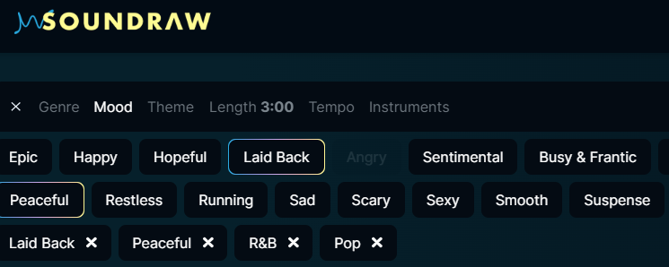
SOUNDRAW
The second AI I used was SOUNDRAW. This was a very interesting AI where different genres, moods, themes, tempo, length, and instruments can be selected to find a sound. I selected laid back, peaceful, R&B, and pop.
(SOUNDRAW, 2023)
It responded with several different options, which I listened to and enjoyed. There were no voices and it seemed as if the options given were from a previously created list. When selecting the options, it provided a list of AI generated sounds that matched my selection. I was under the impression that it created sounds from a unique combination of selections. But overall, it was fun to play around with the different sounds and selections.
Reflection Questions
First of all, I think that the use of ChatGPT is being sensationalized. When computers and the internet were introduced, there were citizens who were concerned about the negative impact it would have on our society. However, as we can see people didn’t become mindless drones now that computers and the internet have become commonplace. As humans when we adapt our use of new technology, there is a shift in our learning and mindsets. Our society’s way of handling AI should be monitored and carefully criticized, but also embraced for the multitude of greatness it can bring.
Have you used AI applications before? If you have, what have you used them for? What apps have you come across that are not in the Explore section that you’ve found useful?
I have used ChatGPT almost daily since it became available in November 2022. It is an amazing tool if used correctly. I use it mainly for studying as it explains concepts extremely well and helps me brainstorm for assignments. As for AI outside of the explore section, I have used PowerBI’s AI “insights” feature. In this feature, when adding components to the visualization page it summarizes the key points of the visualizations created. It is very useful, powerful and has many applications.
What guidelines do you think should be in place to guide their use in an educational institution? What factors should be considered?
I think that the university should allow students to use AI – and I have had several professors say so themselves – but this should come with strict guidelines. AI can be a wonderful collaborator on assignments for example, but it really shouldn’t do all the work. I also suspect it would not do a very good job (as discussed in the Module 5 reading). One factor to consider is that AI detectors do not work 100% of the time. It would be difficult to unequivocally tell if a student has used it or not. Additionally, people will choose to use it whether it is allowed or not. Educational institutions should allow AI for students to utilize, as it most certainly will be a part of their lives after university. We should also ensure students cite it as a source rather than copy the output word for word since it is a useful and powerful tool that students must learn to use effectively.
I had an unfortunate experience working on a group project with a team member who used ChatGPT to generate their entire part of the assignment. I first became suspicious when I noticed that the writing was bland and did not match the topic of the paper. Then we watched our group member copy and paste text into the document. I later verified that it was indeed AI generated with the AI detector. We informed the professor, and he told us we should confront our group member and give them two options: rewrite this work or write about their experience using ChatGPT in this assignment and to add ChatGPT as an author. The student chose to rewrite their section in the end. I felt as though the professor presented us with some solid choices. I think the professor was even a little disappointed when our group member chose to rewrite their work, since reflecting on using Chat GPT as an aid for writing assignments is a unique and new, possibly emerging concept. AI is a new change in our world, and it was refreshing to see that the university is embracing its use.
What might you use AI tools for moving forward? What would you not use them for?
In the future I believe I will use AI for understanding concepts, brainstorming, and editing my work. It seems like it does a great job at doing these things and I find these tasks difficult to do on my own. I am not planning to use AI for creating practice questions, finding sources, and commenting my code. These are more complex, difficult tasks that I have found AI does not do very well yet. I have found that ChatGPT’s results are not complete, correct, or reflective of what I am thinking. But the beauty of AI is that it is always advancing and it will probably improve over time. I am interested to see how it evolves and plan to test it out monthly to monitor this.
Where do you think these tools will be in their evolution in 2-3 years’ time?
I think the expansion of AI will drastically evolve over time. It is really difficult to know exactly how AI will advance as I expect it will operate in unimaginable ways, making it difficult for us to understand the future ramifications. I do believe that AI will eventually get to the stage where it sounds precisely like humans and is able to do our jobs even better than us. There are already Instagram accounts that mimic the likeness of celebrities but are completely AI. Try searching @yoursisbillie on Instagram. It is an Instagram account of Kendall Jenner – only it is not her, it’s an AI generated likeness of her completely controlled by AI. I think that eventually AI will be accepted by humans, and it will become a normal part of our life – like computers. At one point, we will not even remember what life was like before AI.
What examples have you seen of good data visualization?
I really enjoyed the presentation by David McCandless “The beauty of data visualization” for this module’s reading. He showed some very straightforward, informational, and aesthetically pleasing data visualizations. Additionally, during the COVID-19 pandemic, there were several dashboards that showed the spread of COVID like this one by the World Health Organization . One of my favorite examples of data visualizations is Florence Nightingale. During the Crimean War, Nightingale collected and analyzed vast amounts of data on mortality rates among soldiers. Her diagram, The Nightingale Rose Diagram, was used to show the number of deaths caused by preventable diseases such as typhus, typhoid, and cholera in military hospitals. By visualizing the data in this way, she could clearly show that a majority of the deaths were due to poor sanitation. Her visualizations effectively correlated the significance of hygiene and sanitation, leading to improvements in healthcare practices and policies (DataCamp, 2023).
Have you come across any examples of data represented in a way that is false or misleading? How did you recognize that?
I did an interdisciplinary, self-directed class last semester where I created data visualization dashboards for the Vancouver Island Health Authority. Although I was the one creating the visualizations, I found that several times the graphs and measures resulted in misleading results. I did not realize how easy it was to do this beforehand. I always thought that data is data and that it cannot be manipulated. But I was very wrong. I realized this by analyzing how the visualizations change with different summarizations. If I switched between sum, average, and median, I got a variety of different graphs. It was important that I analyzed how the data was collected, how the data is formatted (percentage, whole number, etc.), and how graphs present the data. It was very easy to mislead the viewers.
Below I have my elevator pitch presentation from this class if you would like to view it. Please note that this was before this class and if I could go back in time, I would definitely implement some of Mayer’s Principles into my presentation!
I loved reading your Module 3 post. I agree that storytelling is such a beautiful way to connect to people. My favorite moments with family are recounting of old, new, and forgotten stories. Your Twine story was also so lovely to read. I loved the use of Mayer’s personalization principle to share your story about moving to the Netherlands. It seems like we have a shared experience of homesickness. I moved to Egypt for a year when I was in high school with my family. The move from a quiet, west coast city to a hot, dusty, crowded city without knowing the language was a huge culture shock, but I promise you get use to it! Additionally, your experience taking to your parents about residential schools is tragic yet beautiful. Stories really connect generations, trauma, and most importantly healing.
I really like how you used the word “leverage” when writing about storytelling and learning. I think that its a perfect way to explain this module. I also loved your Twine story; it was really cute and entertaining. Thank you for sharing your uncle’s story. You did a great job of using the same techniques you mentioned like suspense and tension. I also had the exact same thought about the Leslie’s story. When she brough out the gun, my heart skipped a beat. This was her use of storytelling; she made the viewers confront something she personally had to experience. It made for a shocking, attention holding, and personal story and lesson. I think that your insight into using the personalization method along side Mayer’s segmenting and signalling is something that myself and others also aspire to. It is a difficult skill.
Hi Nat, I really liked your Twine story. The music and images really added to the story. Thank you for sharing. Looks like I got an A+ from your Twine story, I hope that for this class too 😊. You did a great job of explaining examples from the TedTalk video to the techniques you saw. Great job. I also see that you used these elements in your Twine story, this is probably why I liked it so much.
In this module, I learned and applied principles of learning design and active learning. I had the opportunity to explore H5P, learn about active learning, create a lesson plan, and reflect on my learning experiences.
H5P
Word Search
Structure of a Tree
Lesson Plan
Overview
This week, students will be learning about trees. They are essential for maintaining the balance of oxygen and carbon dioxide in the atmosphere, providing habitats for various species, preventing soil erosion, and providing resources crucial for human survival and well-being. Trees are part of the science curriculum and are required by the British Columbia Grade 3 curriculum. Last week students learned about plants, providing a basis as to what trees are and their importance. Next week students will learn about the environment, which trees are an important member of.
Here is a link to a video that will introduce students to the importance of trees.
Lesson Objectives
By the end of the lesson:
Learners will be able to identify the different parts of a tree.
Learners will be able to name the different types of trees.
Learners will be able to identify trees in nature.
Learners will understand the importance of trees on our planet and in our ecosystem.
Read/Watch
Students will watch this video and read “The Busy Tree” by Jennifer Ward.
Since students are young, parents will be asked to set up the video and read the book to the students. The book will be available in the classroom for parents.
Content
The teacher will review the different parts of a tree by using a diagram and illustrations.
The teacher will explain the two types of trees with pictures.
The teacher will explain how trees provide oxygen and how this affects people and the planet.
The teacher will explain how leaves, wood, and food are harvested from trees to provide humans with resources.
The teacher will explain how animals use trees for homes and food.
Application
Students will complete both H5P learning activities (Structure of a Tree and Word Search) to test their knowledge of the topics.
Students and teachers will walk around the school grounds and identify trees as well as each type.
Students and teachers will walk around the school and identify where and how trees are being used (food, wood, etc.).
Students will go home and complete a similar activity. They will write down three examples of trees being used in and around their home.
These activities will allow students to apply their knowledge from the classroom and show their understanding of trees.
Reflection
Students discuss their findings from home the following day with 2-3 other students and they will answer the following questions in their group:
What was the most surprising find?
How do you think trees affect your life day to day?
What types of trees did you see around your home? Why do you think this is?
Afterwards the teacher will lead a classroom discussion on their findings.
To Do This Week
Watch the video “Trees for Kids”
Read the book “The Busy Tree” by Jennifer Ward
Complete H5P activity: Word Search
Complete H5P activity: Structure of a Tree
Identify three ways trees are used in and around your home
Have a discussion with a group of 3-4 students
References
Learn Bright. (2020, May 4). Trees for Kids | Learn all about trees in this fun educational video for kids [Video]. YouTube. https://www.youtube.com/watch?v=uipjCTg_PqQ
Scaffolding content. (2023, July 27). Office of Curriculum, Assessment and Teaching Transformation – University at Buffalo. https://www.buffalo.edu/catt/develop/build/scaffolding.html
Super Simple Play with Caitie! (2019, July 22). Let’s learn about trees | Caitie’s Classroom [Video]. YouTube. https://www.youtube.com/watch?v=vitsF-tC8xM
Reflection Questions
Where do you see constructive alignment and backward design used in this course or another course you are taking/have taken? Is there anywhere where it seems to be missing?
I think that the majority of my university courses have all had constructive alignment and backwards design, but have also been poorly executed. All professors are required to abide by some sort of course outline and objectives which are set by the university. Professors also need to test students to assess their knowledge and ensure they can pass the class to continue their studies. I think the issue comes from the disconnect between this step (testing) and the next step (lessons). In my experience, professors do not cover exam topics enough or completely leave out important exam questions from lectures. This makes it impossible to do well in the class. I feel this is strongly the case in Calculus I and II. There seems to be a disconnect between step 2 and step 3 of backwards design and between assessment and teaching in constrictive alignment.
How have you found the balance of passive and active learning in this course for your learning? How does it compare to your experience in other courses?
I have really enjoyed the balance of passive and active learning in this course. I like that we are required to read or watch educational material and then actually apply the theories. I find that really getting my hands dirty allows me to learn and understand the subject matter better. Unfortunately, this has not been my experience in other courses. As a STEM student, I find that lectures are often simply an opportunity for professors to tell us what to learn. In class, we feel lucky when we have the opportunity to review one simple example question or theory. Outside of class, I have had to practice active learning myself by reviewing questions. There are a few classes that focus more on active learning. For example, this semester I am taking an Augmented Cognition class, and in lectures the professor uses multimedia to test our cognition and we will usually have discussions afterwards. I have found that I not only need to study less, but I look forward to attending the classes. STEM professors have a lot of content that needs to be reviewed and this needs to be taken into consideration. However, I believe that the professors who take the time to implement active learning have much better student engagement and higher student grades.
What was your experience of trying out H5P? Which of the activities do you think you would make most use of in your teaching context and what would you use them to do? Which ones do you think require the most resources to create?
I had a great experience using H5P. It was generally easy to use, and in the end, I created fun and exciting teaching activities. I created two H5P activities, the first one being a word search. I would consider this to be passive learning as students are simply looking for words. This helps students become familiar with the vocabulary and can help with memorization. I also added an activity where students can match the parts of a tree to the words. This allows students to test their knowledge and promote active learning. I did find an issue where the correct section of the tree gets highlighted when you choose a word to drag – but I could not find a fix for this!
I believe that course presentation, interactive videos, crosswords, drag the words, drag and drop, fill in the blanks, find the hotspots, find the words, and image pairing are all great choices for teaching the topic of trees to young students. The course presentation would provide a great way to present the lessons that are engaging and fun. The interactive videos would create a way to present lessons or teach students when they are home or if the lessons are self-paced. I might create a lesson using the interactive video that shows the structure of trees or how to plant them. The crossword puzzles and find the word activities create a way for students to become more familiar with and memorize new vocabulary. Drag the words and fill in the blank activities would create a lesson that tests student comprehension. I might ask students to fill in words of key points during the lesson. The hotspot would be a great way to test students’ comprehension for visual tests. For example, I might ask students to identity which tree is coniferous. Lastly, image pairing tests students’ knowledge and it could be used to match trees and their respective cones or leaves.
On the other hand, virtual tours and AR scavenger would both require more resources and time. I have seen a presentation on AR and virtual tours, and they are very time consuming to create. Additionally, they require knowledge and experience with this technology to be fully useful. I believe that students in middle or elementary school may not fully understand the technology and therefore might not learn from it. Lastly, AR and virtual tours will require technology for each student/group of students, and this may not be possible from a financial perspective.
In the reading, Students Need to DO Something, do any of the author’s experiences with passive learning in K-12 classrooms resonate with your own? Why do you think active learning is not more prevalent in K-12? Have you tried using any of these activities in a classroom? Which one looks most appealing to you?
I believe I had a very similar experience in middle and high school. In elementary school, I remember going outside to look at plants, making bracelets to signify the steps of the water cycle, and going to Goldstream Park to learn about salmon. In middle and high school, learning becomes more abstract, and it becomes more of a challenge to teach with the active learning method. In my experience, many teachers seemed to focus more on providing students with information and then testing them on it. Additionally, teachers didn’t always seem to have the time, energy, or the tools to facilitate active learning. When there is more information to teach, it is much easier to put the information on a PowerPoint and play it to the class. I have also tried several of the examples given in the reading. And not surprisingly, they are easy to remember. For example, I did a mini-project on Celine Dion in Grade 6 and I still remember a lot of facts about her and her career. Although I have yet to try it, graphic representation is the learning style that appeals most to me since I am a very visual learner. Therefore, I can see that creating graphics would help me learn.
Can you describe (step by step) an example of scaffolding in a learning experience that you’ve designed or experienced?
This learning experience occurred in my Grade 9 year. My teacher, Mr. Bell, did an excellent job using the scaffolding strategy.
Determine what students already know: At the beginning of his class, we took an exam to assess the math we learned in middle school. This allowed him to understand the class level as a whole.
Set a learning outcome: Mr. Bell would have looked at the Grade 9 curriculum and set learning goals based on the class’s current level and adjust the curriculum accordingly.
Plan instructional supports: Mr. Bell would next have created lessons that supported students in reaching their learning outcomes. This would also include reviewing Grade 8 material where needed based on the assessment.
Implement lessons and monitor progress: Mr. Bell then taught the lessons. He would give us weekly quizzes to access our knowledge to ensure student progress. He would then teach us by providing numerous example questions.
Fade support: Mr. Bell gave us homework to complete at home, testing us until we were independently successful.
Continue to build on content, monitor, and provide feedback: Mr. Bell continued to quiz and test us, and provide feedback to ensure students were learning and continued on track.
References
Learn Bright. (2020, May 4). Trees for Kids | Learn all about trees in this fun educational video for kids [Video]. YouTube. https://www.youtube.com/watch?v=uipjCTg_PqQ
Scaffolding content. (2023, July 27). Office of Curriculum, Assessment and Teaching Transformation – University at Buffalo. https://www.buffalo.edu/catt/develop/build/scaffolding.html
Super Simple Play with Caitie! (2019, July 22). Let’s learn about trees | Caitie’s Classroom [Video]. YouTube. https://www.youtube.com/watch?v=vitsF-tC8xM
This assignment, Video for a Learning Purpose, created an opportunity for me to apply my module 1, 2, and 3 skills into an instructional video. I had a lot of fun creating an instructional video for the first time. It allowed me to be creative, while still having an educational purpose. Below will be an introduction, YouTube link to my video, reflection questions, storyboard, audio/visual script, and audio script.
This module teaches students how to walk a dog. To complete this lesson, you will need at least one dog, a harness and/or leash, poop bags, and treats.
For this video, I taught viewers how to walk a dog. I love my dog and I wanted to include him in a school assignment before I finish my degree, so this seemed like the perfect opportunity. Before we got Ferris, I was not entirely sure how to walk dogs so I thought an educational video may help new dog owners.
Which of the principles we’ve covered this term (e.g., Mayer/Universal Design for Learning/Cognitive Load Theory) did you incorporate into your design and why?
Mayer’s Principles and Cognitive Load Theory
Extraneous Load
The coherence principle was used by eliminating unnecessary audio and video to reduce extraneous load. I highlighted key points such as the step and items needed for walking a dog by using text on the screen to emphasize to the learner that these are important elements, as per the signaling principle. At the same time, I utilized the redundancy principle by having the text on screen limited to again reduce extraneous load.
Intrinsic Load
The segmenting principle was employed by breaking down the video into steps and not including too much detailed information. The introduction and list of items required for the learner to have ready before viewing the video were added to create a foundation for learning as per the pre-training principle. I also used the spatial contiguity principle by having the text and visuals close together to limit learner confusion. By using my voice to explain the steps and acting them out, I was able to help the learner better understand the activity, which is recommended by the modality principle. I used the multimedia principle by using narration and video to ensure both channels (dual coding theory) are used together for optimum learning.
Social Cues
I used conversational language and my own voice to utilize the personalization and voice principles to allow the learner to feel more relaxed and promote learning.
I also encouraged learners to try walking their own dog and share their experiences to engage students, as per the active processing principle.
Universal Design for Learning
To ensure that my video is accessible to all students, I have included several features in my video. I created custom captions to enhance the viewer’s learning and to make my speech clear. I also included a script detailing all of my words and actions for text to speech readers. Lastly, since the video is on YouTube, learners can pause, play, rewind, forward, and change the playback speed.
What was challenging about capturing your own video?
In general, I found this assignment challenging since I have never filmed a video like this before. I have filmed screen captures before, but never something where I had to act. I also found the process extremely taxing and tedious. I wanted to plan everything out very well as I did not want to reshoot. A lot of preparation was needed, there were many steps to produce the video, including creating the script and storyboard, practicing the script, practicing Shotcut, filming, editing, creating the audio captions, and uploading. On top of this, even reshooting a scene 20 minutes later could change the lighting or positioning of the video clips. This made filming very stressful. Furthermore, there was a lot of background noise: cars driving, people walking and talking, and chestnuts falling, which forced us to reshoot several times. Lastly, my dog hates walks so he looked apprehensive in the video. Overall, the process was very challenging, especially since it was my first time creating a video.
What did you find easiest?
Surprisingly enough, I found creating the captions the easiest part of the assignment – I assumed that it would be difficult. To ensure I was following standards suggested online, I read a few articles about audio caption creation. I learned that I should make the captions reflect what was said exactly, including punctuation. Additionally, I discovered that the captions should be no more than two lines at a time and should start and end at the same time as the actual audio. I created the captions on YouTube. The platform has a very intuitive layout, and I was able to create the captions in about 20 minutes. It provided suggested start and end times and was very visual. It also gave me an opportunity to review my video for any mistakes. The writing itself was very easy as I had a script created beforehand, so I was able to simply copy and paste the words.
How would you approach capturing video differently next time?
First of all, even though I took the video preparation very seriously, I think even more preparation should be done in the future. I found that my script sounded robotic; I think with more practice I might have noticed this. Next time I would practice the script more before filming to ensure that the script sounded natural. Additionally, I would film the video clips differently. I would make sure the recording started, wait a few seconds, and then begin talking. There was one clip in the video where I started to talk right away, and it sounded odd. Additionally, I would make sure that my background is very plain if I have text on the screen. I filmed mostly in front of a door, which seemed plain, but with the peep hole, jackets, and lines on the door, it made the text difficult to read. Additionally, I would make sure there would be more room below me for the audio captions and that I look directly into the camera lens. I would also make sure to film a few takes for each clip. Once I filmed one clip, I would jump to the next. There was one clip where I realized that I misspoke slightly, and wish I had another video clip to replace it with. If I really wanted to make my video look professional, I might buy a phone stand. I noticed a few times that my videographer, my dad, swayed a little while filming. Lastly, if I were to film a video like this again, I would use another editor. Shotcut was good but I couldn’t use as many signaling principles as I would have liked. There was no pulsing animation or any way to signal to specific text. I also found that my final product didn’t look as aesthetically pleasing or professional as I would have liked.
Supporting Documents
Story Board
Narration: Hello Everyone, my name is Maya. Today I will be teaching you how to walk your dog. Dogs on average need 3 to 4, 15-minute walks per day.
Text: 3 to 4, 15-minute walks per day
Narration: To keep your dog healthy, it’s important to frequently get your dog outside to get their exercise daily
Narration: First, here is a list of things you will need: a dog, harness and/or leash, poop bags, and treats
Motion: point to one side
Text (to one side): Dog Harness and/or leash Poop bags Treats
Narration: Now here are the steps to walk your dog:
Text: 1. Get yourself ready 2. Ensure you have poop bags and treats on you 3. Get your dog ready 4. Start the walk 5. Give your dog treats when you are back 6. Unleash your dog
Narration: The first step is to get yourself ready. I have jacket, warm clothes and runners on
Text: 1. Get yourself ready
Narration: Step 2, ensure you have poop bags and treats on you
Text: 2. Ensure you have poop bags and treats on you
[me holding poop bags and treats]
Narration: Next get your dog ready. I will need to get Ferris’ harness and leash on
Text: 3. Get your dog ready
Narration: Now it’s time to start the walk and enjoy
Text: 4. Start the walk
Motion: Maya and Ferris walk out the front door
Motion: Maya and Ferris cross the street
Narration: When you are walking your dog, try to keep them on a short leash and if another dog comes by give them a treat to keep his attention on you
Motion: Maya feeds Ferris
Motion: Maya and Ferris walk down the street
Motion: Maya and Ferris walk and go back to the house
Narration: When you are back from your walk, ensure you give your dog treats
Text: 5. Give your dog treats when you are back
Narration: Finally, unleash your dog
Text: 6. Unleash your dog
[unleash Ferris]
Narration: I encourage all dog owners to walk their dog today and tell me how it went!
Text: Thank you for listening
Story Board
Audio/Visual Script:
Maya: “Hello everyone my name is Maya and today I will be teaching you how to walk your dog. Dogs need on average 3 to 4, 15 minute walks per day.”
Text on screen: 3 to 4, 15 minute walks per day
Maya: “First, here is a list of things you will need to walk your dog”
Text on screen: Dog, Harness and/or leash, Poop bags, Treats
Maya: “Now here are the steps to walk your dog”
Text on screen:
1. Get yourself ready
2. Ensure you have poop bags and treats
3. Get your dog ready
4. Start the walk
5. Give your dog treats when you are back
6. Unleash your dog
Maya: “The first step is to get yourself ready, I have jacket, warm clothes and runners on”
Text: 1. Get yourself ready
Maya: “Next, make sure you have treats and poop bags”
[Maya shows that she has green poop bags and dog treats]
Text on screen: 2. Ensure you have poop bags and treats
Maya: “Next get your dog ready, I’m going to put Ferris’ harness and leash on”
[Maya gets a harness on Ferris (a miniature Australian Shepard)]
Text on screen: 3. Get your dog ready
Maya: “Now its time to start the walk”
Text on screen: 4. Start the walk
[Maya and Ferris walking]
Maya: “While walking your dog, try to keep him on a short leash and if another dog comes by give him a treat to keep his attention on you”
[Maya gives Ferris a treat]
[Maya and Ferris walking]
[Maya and Ferris going back into the house]
Maya: “When you get back from your walk, make sure you give your dog a treat”
[Maya gives Ferris a treat]
Text on screen: 5. Give your dog treats when you are back
Maya: “Finally, unleash your dog”
[Maya takes the harness off Ferris]
Text on screen: 6. Unleash your dog
Maya: “I encourage all dog owners to walk their dog today and tell me how it went!”
Text on screen: Thank you for listening!
Audio Script:
Maya: “Hello everyone my name is Maya and today I will be teaching you how to walk your dog. Dogs need on average 3 to 4, 15 minute walks per day.”
Maya: “First, here is a list of things you will need to walk your dog”
Maya: “Now here are the steps to walk your dog”
Maya: “The first step is to get yourself ready, I have jacket, warm clothes and runners on”
Maya: “Next, make sure you have treats and poop bags”
Maya: “Next get your dog ready, I’m going to put Ferris’ harness and leash on”
Maya: “Now its time to start the walk”
Maya: “While walking your dog, try to keep him on a short leash and if another dog comes by give him a treat to keep his attention on you”
Maya: “When you get back from your walk, make sure you give your dog a treat”
Maya: “Finally, unleash your dog”
Maya: “I encourage all dog owners to walk their dog today and tell me how it went!”
References
Captioning key – Sound effects and music. (n.d.). https://dcmp.org/learn/602-captioning-key—sound-effects-and-music
Captioning quality guidelines. (2023, July 28). Digital Accessibility Office. https://www.colorado.edu/digital-accessibility/captioning-service/captioning-quality#:~:text=WebAIM%20Contrast%20Checker.-,Complete,its%20own%2C%20above%20the%20captions.
Knott, R. (2023). How to write a script for a video (+Free template!). The TechSmith Blog. https://www.techsmith.com/blog/how-to-write-script-for-video/
Mayer’s 12 Principles of Multimedia Learning. (2023, June 2). Digital Learning Institute. https://www.digitallearninginstitute.com/blog/mayers-principles-multimedia-learning/
Hi Nicole! I loved reading your Module 2 post. I had the exact same errors on my WAVE report! I am glad I wasn’t the only one. I also really liked your quote from Kat Holmes. A mismatch between a person’s abilities and the environment is a perfect way to explain how to approach inclusive design. I also had the same thought about the text-to-speech accents, they are too distracting! I also never thought about the different ways I use text-to-speech like using Siri to read my texts while driving – what an interesting perspective.
I love how you reflected on the WAVE report and implemented it in your infographic by reducing contrasting colors. I did read that contrasting colors are good for infographics. I wonder how teachers should find a happy medium between the two schools of thought. Your infographic is easy to read and since you used the personalization method, I felt more drawn to read it as it told me about yourself. I also appreciate you standardizing the text to follow one of the six recommended practices.
Thank you so much for sharing and I can not wait to read more of your posts,
Hi Addi! I loved reading your Module 2 post! I had the same thought about the WAVE report, it is so easy to miss small details, but they can make a huge impact on learning. I also tried the Snoop Dog voice and found it distracting. But as you mentioned, it could be useful to another learner. I also agree with you that captions are a wonderful example of how accessibility is used by a wide variety of people with and without disabilities. Accessibility measures should be taken at every opportunity as to enhance the learning experience for all. I also had the same thoughts about the World Worst PowerPoint Presentations. They are full of clutter, inconsistency, and lack of Mayer’s Principles.
Additionally, I love your infographic. I didn’t think about how templates may impact creativity. That is a very good point. I think they are good for when you are just starting out as they create a good starting point, but they can create a very narrow image of what the infographic should look like. I can see that you used the segmenting principle by having the topic ordered into a step-by-step process. The spatial contiguity principle was well used as you had images right beside the corresponding text. Additionally, as per the coherence principle, the infographic had just enough information and was not crowded. Lastly, your alternative text was extremely detailed, I am impressed.
I also never heard about tactile graphics, thank you for sharing. I was able to learn something new today because of you!
I really enjoyed your module 2 post. After reading your reflection about the amendments you made to your site because of the WAVE report, I realized that I had actually noticed these two issues. When I clicked on your site today, I instinctively felt as thought it was easier to navigate. It is so interesting how well the WAVE report worked and how my subconscious felt about the site. Additionally, I am intrigued that you liked the Irish voice for the speech-to-text! I wonder why that is. Do you have friends or family with that accent? I also felt that the World’s Worse PowerPoints were a great way learn what NOT to do!
Your infographic looks awesome! I love how you took the advice of your WAVE report and used contrasting colors (red and blue). Your infographic also used the segmenting principle by having the topic ordered into a step-by-step process. I also appreciated that your infographic was simple and did not overwhelm my cognitive load. I liked that you used images and text, displaying the dual-coding theory. You also abided by the eight rules of infographics for example leaving negative spaces and having balance.
With this module I had the opportunity to explore the usage of storytelling to enhance learning. I believe it is a very innate, human experience to love storytelling. This is evident as humans gravitate towards books, movies, and family stories. Last weekend, I went to my grandparent’s apartment and heard stories about them immigrating to Canada from Egypt. Their stories stuck with me, and I hope to pass their stories on to my children to teach them about perseverance. The module reading and my grandparents’ stories really made me realize how powerful storytelling can be while teaching. It allows the learner to imagine and visualize the situation. I am looking forward to applying this in Assignment 2.
Twine
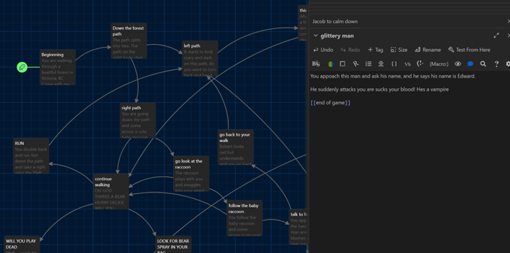
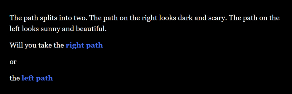
Twine is a storytelling application that allows users to create stories that are “choose your own advantage” style. First of all, I spent some time watching YouTube videos to ensure I knew how to create a story on Twine. After I felt comfortable using Twine, I started creating my story. I did not have a strict plan when creating the different story paths, but I naturally used some of my personal stories/experiences. In one section of my story there is a bear attack and my uncle recently survived one. In my story you have the chance of meeting Robert Irwin, who I enjoy following on Instagram. There is also a chance that Jacob and Edward may join the story as well.
Below are a couple screenshots and a link to my Twine story.
Describe a meaningful learning experience that started with a story that you heard. What made it impactful for you? What senses did it appeal to? Did you recognize any of the storytelling techniques reviewed this week?
When I was in Grade 3, I had an older teacher who used to tell us stories of her childhood. She told the class that her family was Jewish and when the Holocaust began, her family survived by living in their neighbour’s attic. She was a baby at the time so when searches were conducted of the house, her mother kept her quiet by feeding her Tootsie Rolls. She would always hand out Tootsie Rolls as she told us these stories. I am always transformed back into Grade 3, sitting on the carpet listening to these harrowing stories whenever I see, smell, or eat a Tootsie Roll.
I did not understand the significance of the Holocaust at the time, but once I heard about it again in high school, I realized that I had heard about it before. It made me more interested, and I felt as though I had a personal connection to it. This teacher telling the classroom about her family’s story made use of Mayer’s Personalization Principle.
Overall, this story will always stay with me, and I feel privileged to have heard it.
In the reading this week, 7 Storytelling Techniques Used by the Most Inspiring TED Presenters, which of the presenters did you find most compelling? What technique(s) did you recognize in their talk?
The story that I found most compelling was Richard’s story about using technology to scare lions on his father’s farm. The story was short, yet powerful. Everything he said was on topic and the pacing was exceptional. He talked in a friendly and natural manner which aligned with the Mayer’s Personalization Principle. He had many visuals that complimented his story as they were relevant and enhanced the story. For example, he said that his father’s livestock was killed by lions. Then an image appeared that showed a graphic photo of cow that had been killed and eaten. It made me feel compassion and empathy towards his family and provided a personal touch. Overall, I found his TedTalk compelling, educational, and inspiring as a result of his storytelling techniques.
What storytelling techniques have you used instinctively and which ones require more work for you? Which techniques will you focus on moving forward?
I think that I instinctively use Mayer’s Personalization Principle when storytelling. I feel as though I am a very open person who does not mind sharing personal stories. Personalization connects people and provides an appealing way to package information. I also use a conversational tone which is also part of the Personalization Principle. Additionally, I try to keep stories short to maintain people’s attention which is part of Mayer’s Segmentation Principle. The technique that requires more work for myself is to add visual components (Mayer’s Signalling Principle) as I do not often think of adding this. Additionally, I need to be more aware of ensuring that I follow the universal design for learning principles. Just because I do not need supplements does not mean other people don’t need them. Moving forward I will try to include visual components and use universal design for learning principles in my assignment 2 and future work I do.
Hi Skye, I loved your screencast and module 1 post! I really liked your reflection about the signalling principle “simply describing it as ‘showing the words’ instead of ‘saying the words’”. This really struck a chord with me too. I also had the same thought about the pre-training principle. It seems very underused yet powerful. Your screencast was absolutely perfect! It looks like we will be using Canva in the next module, so your screencast acted as a real-life example of pre-training. I think your estimation of it being for high school age students and above was very on point. I really liked how you used the personalization principle and spoke in everyday language. You used the segmenting principle perfectly as you broke down the content, Canva website and functionalities in simple and straightforward way. You also used signalling effectively as you pointed with your mouse and signalled with your voice as well. I was able to follow your instructions and thoughts very well during your screencast. Thank you so much for sharing.
I am looking forward to working together and taking another class together,
Hi Addi! I really enjoyed reading your Module 1 post and watching the screencast. I really agreed with your point that when the personalization principle is used in lectures, I feel more relaxed and can advance my learning. I find professors that use that approach are easier to talk to and I find myself being able to learn better. I also understand feeling overwhelmed when there is too much text on slides, which goes against the redundancy principle. Text and narration of the text is hard for my brain to process as I am trying to read the slides and listen to the professor. As for your screencast, I loved it! I did not use PowToon so this gave me great insight into what a potential end product could be. I absolutely loved your use of the personalization principles. Having a character look like you throughout the video allowed me to picture you presenting the material without too much distraction. Additionally, the video used the signaling principle effectively by having words appear as you spoke. Lastly, the video used the modality principle as you had limited text and used images, your voice, and animation effectively.
Thank you so much for sharing and I am looking forward to working together,
Hi Nicole! I really enjoyed reading your Module 1 post and watching the screencast. It seems like we both had issues with PowerPoint, but I am glad you were able to figure it out and your presentation came out beautifully. I also had the same thought about the pre-training principle! This semester I started to review lecture slides before lecture, like you, and have found that it significantly increased my comprehension of class material. I also agree that this should be encouraged for university classes. I also had the same issues with the signalling principle in high school and even in my university career. Signalling is a vastly underused part of teaching and should be utilized to ensure that students learn the important parts of the lesson. As for your presentation, I loved watching it and learned a lot. Your use of the segmenting principle, as you allowed the user to control the pace of the presentation, really allowed me to pace my learning and repeat sections that I missed. I also appreciated your use of the multimedia principle. You had a mix of text, images, and narration. Lastly, I loved your use of the signalling principle as you used an arrow to point the audio symbol on each slide. This ensured that I knew where to start the audio.
Thank you so much for sharing and I am looking forward to working together,
This module I had the pleasure of reading and exploring Module 2: Design Principles for Effective and Accessible Multimedia. I really enjoyed this module as I got to learn about accessibility in design. There are so many hidden aspects of having a disability that I would have never thought about and I am glad this module has opened my eyes. I also got to learn how to create effective PowerPoints and infographics. Creativity and presentations do not come easy to me so learning guidelines to create both multimedia gave me confidence and practice in making them.
Reflection Questions
What did you find when you ran the WAVE accessibility report on your blog post(s)? What did you expect and what was surprising? Is there anything you will do differently going forward?
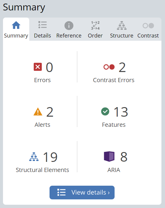
When I used the WAVE accessibility report, I was pleasantly surprised. When I created my site, I regretfully had not really thought about accessibility methods. My summary report is seen below.
I had zero errors, two contrast errors, two alerts, thirteen features, nineteen structural elements, and eight ARIA. I investigated the two contract errors. These were regarding my username and “ 0 comments” font that were a colour too similar to my sites’ background colour. This is something I would have never been aware of had I not created the site, so I am glad to have been made cognisant of this.
I had also created an alert that warned me that I posted a video. Reflecting back to the module 2 lesson and readings, I should have added captions to this video and alternate texts to all my images.
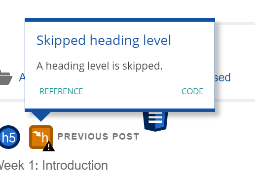
I will ensure going forward that I employ more accessibility methods like this. Lastly, there was an error that a title heading had skipped a heading level. I was not aware of this issue, so I plan to investigate to see if this can be fixed.
Overall, I really enjoyed using the WAVE report as it made me think outside of the box and ensure I include aspects that provide better learning to people of all accessibility levels. I will be sure to use WAVE in my future module posts and any work I do outside of the classroom.
Have you used Text to Speech tools before? Did you find it useful? Did you try out some of the different voices? What impact did the different voices have on your ability to absorb information?
I have never used Text to Speech tools before. I fortunately do not have any audio disabilities, so I have never needed to use tools like this before. I did find the tool useful as sometimes my eyes hurt and listening can be easier than reading. Sometimes I still have a difficult time sounding out words and this tool takes that frustration away. I did try a few sample voices including Gwyneth Paltrow, a British woman, and Snoop Dog. I really enjoyed Gwyneth’s voice as it was soothing and calm – I felt relaxed and was better able to absorb the information. I also listened to a British woman’s voice. I am not used to the British accent, so I sometimes had to rewind a few times to fully understand. Snoop Dog, on the other hand, made me laugh and it actually became a distraction. So for studying I don’t think Snoop Dog would be a good idea, but when I need a laugh it would be a great choice.
What does inclusive design mean to you?
Inclusive design means presenting media with a careful consideration to one’s visible or invisible disabilities. There should be allowances to people with behavioral, sensory, physical, or developmental disabilities. This can include alterative text, captioning, recording presentation, videos with controls, and much more. Although it seems to be extra work for a small percentage of viewers, inclusive design can help a magnitude of people. For example, I find captioning on videos extremely helpful. They allow me to understand people speaking with an unfamiliar accent and see the spelling of words. Furthermore, recording a presentation may help someone who has chronic fatigue syndrome, but it can also help myself by viewing old lectures to review content. Inclusive design must include everyone, regardless of disability, in accessible learning and subsequently help others with their learning.
What do you think the presentations in The World’s Worst Powerpoint Presentations have in common? Which design principles and which other principles (Mayer’s, Inclusive Design, UDL) are they missing?
The World’s Worst PowerPoint Presentations were all unpleasant and confusing to view and understand. I was not able to easily learn from any of the slides. “The Endless ‘Summary’” was just too much of a cognitive load on my brain. There was too much text and information at once, which is part of the Mayer’s segmenting principle. Additionally, the image in the background was distracting, which is a part of the redundancy principles. There was also no use of the Mayer’s signaling principle to important parts of the text. As for the universal design for learning, there was no engagement, representation, or action and expression. In my opinion, it was an overwhelming and somehow dull PowerPoint slide. The slide entitled, “A Symmetrical Rainbow of Confusion”, was equally horrible. The last slide had no signaling, whereas this slide had too much signaling. Almost every word on the slide was coloured, there were odd bullet point shapes, and an unexplained background image. There was too much information on this slide, which should be fixed with the segmenting and modularity principles. There should also be some spatial contiguity as text seemed to float on the screen without explanation. There should have also been balance and negative space on the slide to ensure the design was well done. Lastly, to ensure inclusivity, all the presentations should have included recordings with audio and captioning.
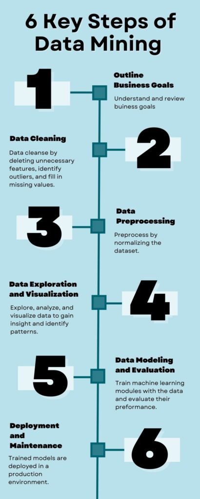
Which design principles did you use to create your infographic in Canva? Which elements of a ‘good infographic’ were you able to incorporate? What other principles did you consider? What does the template make easier and what does it make harder when creating your infographic?
When creating my infographic, I attempted to include all design principles. I tried my best to ensure that each part of the infographic was in alignment with the other sections. I used hierarchy by having a list from one through 6 from the top to the bottom of the infographic. I included balance as I had three steps on each side. I used a blue colour palette that provided unity and pleasantness. I applied repetition by having the same format for each step of the infographic. I also used proximity by having each number beside its retrospective text. Unfortunately, there were a few elements I was not able to include. Although I used a black font with a white shadow for the numbers, I could have used orange to contrast the blue in other areas. However, I was following a template and did not want to stray too far from it. I could have also used more negative space. I did really enjoy using a template as it looked very nice, and I knew before beginning my final product it would look professional and polished. However, my template had seven steps and my final infographic had six. Because of this, I had to reposition each number to fill the infographic properly. This caused the alignment to be changed and this was difficult for me to fix. Templates are a great tool when beginning a project but if a lot of customization is needed, it may be better to start from scratch.
Graphic design is inherently visual – what additions or modifications could you make to ensure that learners with visual impairments have access to the same information in an infographic in an online setting?
To ensure learners with visual impairments can access information on infographics, I think the most important thing would be to have an alternate text. This way, text to speech readers are able to describe an image to the learner. In addition, the text should be extremely detailed and descriptive; it should not only describe what is on the infographic, but also describe the colour palette, images, and infographic flow. For example, my infographic below would have an alternative text that states: An image of an infographics with a light blue colour palette is presented. 6 Key Steps of Data Mining (1) Outline Business Goals: Understand and review business goals. (2) Data Cleaning: Data cleanse by deleting unnecessary features, identity outliers, and fill in missing values. (3) Data Preprocessing: Preprocess by normalizing the dataset. (4) Data Exploration and Visualization: Explore, analyze, and visualize data to gain insight and identity patterns. (5) Data Modeling and Evaluation: Training machine learning modules with the data and evaluate their performance. (6) Deployment and Maintenance: Trained models are deployed in a production environment.
References
Mayer’s 12 Principles of Multimedia Learning. (2023, June 2). Digital Learning Institute. https://www.digitallearninginstitute.com/blog/mayers-principles-multimedia-learning/


Recent Comments